
أهداف الدرس
- أن تقرأ نموذج الصندوق.
- أن تبني شبكة بطاقات تتكيّف مع الشاشة.
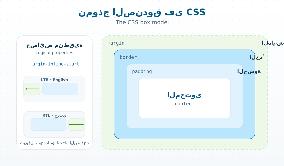
- أن تستعمل الخصائص المنطقية.
بالشبكة تكتب قاعدة واحدة، والمتصفح يقرّر عدد الأعمدة: ثلاثة على الحاسوب، وعمود واحد على الهاتف.
.cards {
  display: grid;
  grid-template-columns: repeat(auto-fill, minmax(16rem, 1fr));
  gap: 1rem;
}

.card {
  padding: 1.25rem;
  border-radius: 1rem;
  margin-inline-start: .5rem;  /* right in Arabic, left in English */
}
margin-inline-start تعني «بداية السطر»: يمين في العربية ويسار في الإنجليزية، فلا تكتب القاعدة مرتين.
تمرين
كيف تجعل البطاقات عمودين بالضبط على الحاسوب؟
الإجابة
grid-template-columns: repeat(2, 1fr) داخل @media (min-width: 48rem)، وعمود واحد خارجه.
Lesson goals
- Read the box model.
- Build a card grid that adapts to the screen.
- Use logical properties.
With grid you write one rule and the browser decides the number of columns: three on a computer, one on a phone.
.cards {
  display: grid;
  grid-template-columns: repeat(auto-fill, minmax(16rem, 1fr));
  gap: 1rem;
}

.card {
  padding: 1.25rem;
  border-radius: 1rem;
  margin-inline-start: .5rem;  /* right in Arabic, left in English */
}
margin-inline-start means «where the line starts»: right in Arabic, left in English, so you never write the rule twice.
Exercise
How do you get exactly two columns on a computer?
Answer
grid-template-columns: repeat(2, 1fr) inside @media (min-width: 48rem), and one column outside it.
التعليقات / Comments
لا تعليقات بعد. كن أول من يسأل. / No comments yet. Be the first to ask.